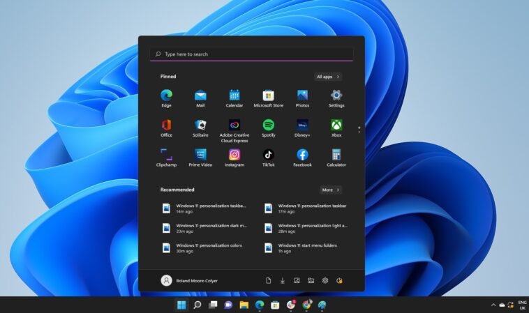
Microsoft is continuously experimenting with the Start menu in Windows 11, and users might soon see a significant change that could make managing apps more convenient. The tech giant is currently trialing a new ‘Category’ layout for the All Apps section of the Start menu, a shift from the traditional layout that many users are accustomed to. This move comes as Microsoft has been exploring various designs for the Start menu, with mixed reactions from users. However, the company remains undeterred, pushing forward with innovations to improve user experience.
A Closer Look at the New Layout
The ‘Category’ layout is an alternative to the standard All Apps section, alongside a grid-based layout that Microsoft has also been testing. Early glimpses of this layout revealed solid-colored squares arranged in blocks of four, indicating it was still in the early stages of development. However, recent updates in the Windows 11 Beta channel show that this layout is becoming more functional, though it remains hidden and requires testers to dig to activate it.
Neater Organization for Your Apps
The more polished version of the Category layout now displays app icons instead of just colored blocks. Each category, such as entertainment, music, or news and weather, can show up to four icons in a 2 x 2 grid. The grid can also bundle more apps together, creating mini-icons that allow up to 16 apps to be listed under a single category. However, these mini-icons are not fully functional yet, as they don’t expand when clicked. This suggests that Microsoft is still refining the feature, and it might undergo further changes before it becomes fully operational.
A Step Towards a More User-Friendly Start Menu
The introduction of both Category and Grid layouts presents a promising alternative to the default Windows 11 Start menu layout, which currently requires users to scroll through a lengthy list of apps. The Grid view organizes apps alphabetically, reducing the need for extensive scrolling, while the Category layout goes a step further by grouping apps into themed categories for easier access.
Looking Forward to Future Updates
The nostalgia for older Start menu designs, where apps were neatly organized into curated categories, is palpable with these updates. Windows Latest speculates that the new Category layout could be functional soon and might even be included in the next major Windows 11 update, version 24H2. However, given that the feature is still in the early stages of testing, it remains to be seen how soon it will be rolled out to all users.
Read more: Logitech C920x HD Pro Webcam: The Perfect Back-to-School Deal


